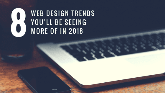
8 Web Design Trends You’ll Be Seeing More Of in 2018
The ever changing website trends
In the days of print media, trends in design came and went
at a snail’s pace, with different fonts and layouts reigning supreme for years
before falling out of fashion. The Internet has changed all that. Web design is
an ever-changing, wildly evolving art form that can be tough to keep up with,
as new styles and ideas quickly coalesce into trends, dispersing just as
rapidly in the span of a few months. What was hip and cutting edge a couple
months ago, could look trite and played-out tomorrow – and by the same token,
what seems garish or muted today could be tomorrow’s new stylistic game-changer. The trends highlighted below are
already gaining steam in 2017, but be on the lookout for them to explode into
full-fledged micro-movements in the year to come.
Cinemagraphs:
A striking image obviously makes for a good backdrop on a website or landing page, but designers looking to add a little extra pizzazz are turning to cinemagraphs to take their backdrops to the next level. Cinemagraphs are photos that are mostly stills, but include a few repeated moving elements that catch the eye without distracting from the overlaying text – say, a scene of a dinner table where everything is stationary but a flickering candle. They’re a challenge to code and to incorporate effectively (since they have to be either high-quality GIFs or streaming videos), but they’re already showing up on some of the most aesthetically advanced sites, and that will likely continue in 2018.
Eye-Catching Typography:
Minimalist fonts have been en vogue for a while now, but the creative pendulum is swinging back the other way. Lately, sites have been employing big, bold letters in innovative ways – like placing a single, large-font word at the center of their landing page to make an immediate impression on customers. There’s a dual impact on the reader as they read the word aloud internally, while also absorbing its role as a visual element in the overall design – a one-two punch of branding. In 2018, look for more big, bold uses of typography, and watch out for fonts that are elaborate and elegantly designed, while still being fully legible.
“Hamburger” Menus:
You probably already know what this means, even if you haven’t come up with a cute name to put to the design. It’s that stack of three lines that appears near the top of many smartphone apps, and it’s become near-universal shorthand for “tap to open the menu.” Originally a way to save space on a small screen, the hamburger icon and its accompanying drop-down menu have migrated over to fullscreen web design. It’s appearing on new apps and sites and being retrofitted to older ones every day, and 2018 is likely to be the Year of the Hamburger.
Microinteractions:
Big, flashy animations and sound cues in response to user actions are falling out of favor, as they tend to distract the user more than engaging them. But user-triggered animations and sounds as a whole are actually on the rise, just in a much more subtle form: microinteractions. These are small, unobtrusive moments that occur when users do specific things on your site – like complete a form, or check a box. Look for more subtle microinteractions in 2018 – they give users feedback that they process on a near-unconscious level, improving user experience without making a big fuss.
Card Design:
Pinterest may not be the social media powerhouse it once was, but the design elements that made it stand out are showing up on other sites. Card-based designs, with clickable rectangles arranged in a grid, are simple, attractive, and highly rated by users, and they’ll show up on more and more sites (particularly those targeted at older web users) in 2018.